Ad

09 November, 2010

10 Usability Tips Based on Research Studies

We hear plenty usability tips and techniques from an incalculable number of sources. Many of the ones we take seriously have sound logic, but it’s even more validating when we find actual data and reports to back up their theories and conjectures.

This article discusses usability findings of research results such as eye-tracking studies, reports, analytics, and usability surveys pertaining to website usability and improvements. You’ll discover that many of these usability tips will be common sense but are further supported with numbers; however, some might surprise you and change your outlook on your current design processes.

1. Forget the "Three-Click Rule"

The idea that users will get frustrated if they have to click more than three times to find a piece of content on your website has been around for ages. In 2001, Jeffrey Zeldman, a recognized authority in the web design industry, wrote that the three-click rule "can help you create sites with intuitive, logical hierarchical structures" in his book, Taking Your Talent to the Web.

Logically, it makes sense. Of course, users will be frustrated if they spend a lot of time clicking around to find what they need.

But why the arbitrary three-click limit? Is there any indication that web users will suddenly give up if it takes them three clicks to get to what the want?

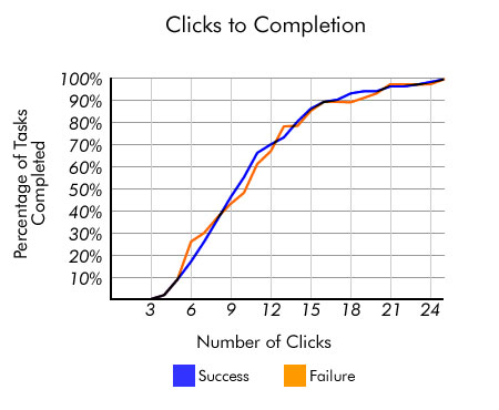
In fact, most users won’t give up just because they’ve hit some magical number. The number of clicks they have to make isn’t related to user frustration.

A study conducted by Joshua Porter published on User Interface Engineering found out that users aren’t more likely to resign to failure after three clicks versus a higher number such as 12 clicks. "Hardly anybody gave up after three clicks," Porter said.

Source: User Interface Engineering

The focus, then, shouldn’t be on reducing the number of clicks to some magically arrived number, but rather on the ease of utility. If you can construct a user interface that’s easy and pleasurable to use, but takes like 15 clicks (e.g. 5 times more than the three-click rule) to achieve a particular task — don’t let the arbitrary three-click rule stop you.

Sources and Further Reading

2. Enable Content Skimming By Using an F-Shaped Pattern

Dr. Jakob Nielsen, a pioneer in the field of usability, conducted an eye tracking study on the reading habits of web users comprising of over 230 participants. What the research study displayed was that participants exhibited an F-shaped pattern when scanning web content.

Source: Alertbox

A similar study, by search marketing firms Enquiro and Did-it in collaboration with eye-tracking research firm Eyetools, witnessed a similar pattern when they evaluated Google’s search engine results page with an eye tracking study that included 50 participants. Dubbed the "Google Golden Triangle" because the concentration of eye gazes tended to be top and left, the results are congruent with the F-shaped pattern seen in Nielsen’s independent research.

Source: Clickr Media

For designers and web copywriters, these results suggest that content you want to be seen should be placed towards the left, and also that the use of content that fits an F-shaped pattern (such as headings followed by paragraphs or bullet points) increases the likelihood that they will be encountered by a user who is skimming a web page.

Sources and Further Reading

3. Don’t Make Users Wait: Speed Up Your Website

We’re always told that our users are impatient: they hate waiting. Well, that’s logical — who likes waiting on purpose? But is there any proof outside of anecdotal evidence that people actually don’t like waiting and that page performance affects website users?

Bing, Microsoft’s search engine, conducted an analysis to see if there are any correlations between page speed versus numerous performance indicators such as satisfaction, revenue generated per user, and clicking speed. The report showed that a less than 2-second increase of delays in page responsiveness reduced user satisfaction by -3.8%, lost revenue per user of -4.3% and a reduced clicks by -4.3%, among other findings. For a company as large as Microsoft, even a 4.3% drop in revenue can equate to multi-million-dollar losses in profit.

Source: O’Reilly Radar

So users, in fact, are impatient: They’re less satisfied and will reduce their number of clicks if they wait too long. And if you care about search engine ranking, then the incentive to improve page response times is even greater since Google now factors page speed in their search ranking.

What can you do to improve page performance? Use tools that will help you find performance bottlenecks, use CSS sprites to improve page speed, and utilize benchmarking tools like YSlow to quickly see where you can make quick front-end optimizations.

Sources and Further Reading

4. Make Your Content Easily Readable

Internet users don’t really read content online, at least according to a study by Dr. Nielsen on reading behaviors of people on his website. His analysis shows that people only read 28% of the text on a web page and decreased the more text there is on the page.

Source: Alertbox

To increase the likelihood of your readers getting the most out of your content, utilize techniques for making content easier to read. Highlight keywords, use headings, write short paragraphs, and utilize lists.

Sources and Further Reading

5. Don’t Worry About "The Fold" and Vertical Scrolling

There has long been a myth that all of your important content should be above "the fold," a term borrowed from newspapers that refers to the area of a web page that can be seen without having to scroll down — first proposed by Jakob Nielsen.

So, are long pages bad? Should we cram everything at the top of our web layouts because people won’t ever read anything below this fold?

The answer is "No" according to a report by Clicktale, a web analytics company. Their results showed that the length of the page has no influence in the likelihood that a user will scroll down the page.

Source: Clicktale

A study reported by Joe Leech of CX Partners, a user centered design agency, indicated that less content above the fold even encourages users to explore the content below the fold.

Source: cxpartners

The main point to take away here is that you shouldn’t stuff all your important content at the top because you fear that users won’t be able to find them otherwise. Use visual hierarchy principles and the art of distinction to prioritize and infer the importance of various elements in your pages’ content.

Sources and Further Reading

6. Place Important Content on the Left of a Web Page

People brought up in cultures where language is read and written from left to right have been trained early on in life to begin at the left of a page, whether in writing or reading a book. This can be the reason why many web users spend a majority of their attention on the left side of a web page — as much as 69% of the time, according to Dr. Nielsen’s eye-tracking study that involved over 20 users.

Source: Alertbox

The same results were reflected on websites whose language were read from right to left, such as Hebrew and Arabic sites, with the results inverted (higher attention on the right side versus the left).

There are two things to take away from this result. First, the language of your site matters when thinking about layout considerations; when designing websites you should consider cultural design considerations. Secondly, for sites that are traditionally read from left to right, placing important design components at the left is a good idea; vice versa for sites whose language is read from right to left.

Sources and Further Reading

7. Whitespace of Text Affects Readability

Easy readability of text improves comprehension and reading speed as well as enhancing the likelihood that a user will continue reading instead of abandoning the web page. There are many factors that influence ease of readability, including font choices (serif versus sans-serif), font-size, line-height, background/foreground contrast, as well as spacing.

A study on readability tested reading performance of 20 participants by presenting them with the same text blocks having different margins surrounding the text as well as varying line-heights (the distance between lines of text). It showed that text with no margins was read faster, however, reading comprehension decreased. Faster reading speeds when the text had no margins can be explained by the text and paragraphs being closer together, resulting in less time needed to move the eyes from line to line and paragraph to paragraph.

Source: Software Usability Research Laboratory

As this particular study shows, the way we design our content can greatly impact the user’s experience. Be wary of the details: color, line-heights, tracking, and so forth and be mindful of sound typography principles for the web to ensure that you’re not discouraging your users from reading your content. Furthermore, study the effective use of negative space in web design.

Sources and Further Reading

8. Small Details Make a Huge Difference

Too often, we look at the big picture when creating a web design and ignore the little things when we’re in a time crunch. We forego any thought put into the wording of something, or the design of a single button on a form if time and resources are limited. There are so many other things we need to think about that it’s often easy to let go of the small stuff.

But something as small as a form’s button can affect the success of a site, at least according to user interface design expert Jared Spool, who wrote about a case on how removing a button and adding a clear error message to avoid user errors in a checkout process increased revenue by $300 million in just a year. The first month witnessed a 45% additional sales attributed to the revision of the checkout process.

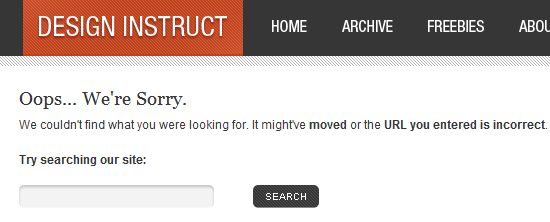
This attention to detail being important is echoed by Flow, a user-centered design firm. They found that by revising their error page so that it contained useful help text improved completed checkouts by 0.5% per month, which if extrapolated, could mean an additional quarter of a million pounds annually for the particular site.

The message they used? A polite two-sentence message instead of a cryptic 404 error: "We’re sorry, we’ve had a problem processing your order. Your card hasn’t been charged yet. Please click checkout to try again."

Pay attention to the details. Use A/B split testing to test your hypothesis and find out what is the most effective design that achieves better results. Set goals using analytics software to benchmark results of design tweaks in relation to site objectives.

Sources and Further Reading

9. Don’t Rely on Search as a Crutch to Bad Navigation

Users expect navigation to be easy to use and well organized. Even with an excellent site search engine, users will still turn to primary navigation first. According to a task test conducted by Gerry McGovern, over 70% of the participants began the task he gave them by clicking on a link on the page as opposed to using the search feature.

This result is similar to a test by UIE of 30 users that tracked e-commerce tasks. The research analysis concluded that "users often gravitated to the search engine when the links on the page didn’t satisfy them in some way." Thus, search is most often utilized only when the user has failed to discover what they were looking for in the current page.

The lesson to be gained here is clear: Don’t rely on site search to remedy poor content organization, findability issues, and bad information architecture. When users are unable to navigate to what they are looking for, attention should be diverted to layout, navigation, and content organization improvements, with improving search functionality as the secondary priority.

Sources and Further Reading

10. Your Home Page Isn’t As Important as You Think

Visitors to your website are less likely to land on your home page. Search engines are a big factor here, as they’ll link to whatever page is relevant on your site. Links from other websites are also likely to link to pages beyond your home page if that’s where the relevant information is.

According to an analysis by Gerry McGovern, page views sourcing from the home page of websites is decreasing dramatically. He witnessed a drop from 39% from 2003 to only 2% in 2010 of page views coming from the home page of a large research site. This trend was doubly confirmed on another site he studied, where page views sourcing from the home page halved in just two years (from 10% in 2008 to only 5% in 2010).

McGovern’s results indicate that traffic, more and more, is coming from external sources — search engines, social media sites such as Twitter, and content aggregator services such as AllTop — rather than from the front page of a website. Therefore, a higher focus on landing pages versus your home page can get you more bang for your buck in terms of conversion and user-retention opportunities.

Sources and Further Reading

09 June, 2010

Five Simple but Essential Web Usability Tips

The web has become a part of our lives. Folks from all walks of life, from upscale parts of New York to dirt road villages you probably will never hear of in Burundi, are all a part of what we call "the internet". The reasons they use the web is highly varied: it could be to search for news articles, directions to the nearest pub, the winter/fall clothing trends, post-grad research, or shopping for a handbag, the list is endless. It could be anyone too. It’d be impossible to try to classify web users in any particular demographic range.

On top of the web’s ubiquity, the web has gotten to an interactive all time high. Users don’t just seek information, they interact with it in more novel ways than we can ever imagine.

And it’s only going to get better: we are seeing a myriad of emerging web apps and website trends that are revolutionizing the way we use and obtain information on the web.

With this concept in mind, usability, how effortless it is to interact and use your website, is critical to its success. This article discusses five important usability tips that your site can’t live without.

1. Have a search feature

A basic site feature nowadays is a search feature. It allows your users to jump to the pages that may contain the information they’re currently seeking.

Locate the search box where users can immediately find it. Placing it on the top left or top right of the webpage will ensure that users see it almost immediately. Make it stand out.

The submit button can also be made to stand out by using vivid colors that fits the design theme.

The "GO" button on Amazon.com is bright orange, congruent with the company colors, to help users quickly see it.

Very often, the magnifying glass icon is used to associate the search function and is now becoming a reasonably identifiable symbol for "site search".

Ubisoft uses the magnifying glass icon to identify their search input field.

On deviantART, the search is identified with a magnifying glass icon and the word "Search…"

2. Pay special attention to web page organization and layout

The use of headings, lists, and consistent structure cannot be overly emphasized. Users tend to scan through web pages in an F-shaped pattern. They pick out what stands out from the rest of the text: headings, links, bold text and bullet points. Use headings and subheadings that are eye-catching so that users can focus on them and quickly process the content while scanning through the page.

Use CSS for layout and style where possible. This ensures that structure and presentation are kept totally separated, giving you an edge when it comes to experimenting on page organization and structure by trial and error.

3. Keep the user interface consistent

A good interface design influences user behavior, prompting them to take an action or route that will result in their desired outcome. This ultimately translates to saying that the design should be intuitive. Keeping the interface simple makes navigation easier for the user. First time users quickly become regulars if the interface design is clear and consistent.

Use a global navigation that appears on every page of your site in the same place. Make your buttons or links consistent with the central theme of the website. Choose the right color schemes.

Apple features a primary navigation that visually indicates what section you’re in.

When hovering over a primary menu item, it becomes recessed, indicating that it’s the focused element.

4. Structure web forms correctly

When you have web forms on your site, you want to make it as easy as possible to fill out. To illustrate key design tips for designing usable web forms, let’s look at the Yahoo! sign up form.

In the figure above, you can see that there are text hints in the input fields for First Name, Last Name, birth Day and birth Year so that there’s no ambiguity to the order that the input fields require. For example, there is no question as how to format your name: Last Name, First Name or First Name, Last Name.

You can remove these inline hints when the user focuses on the input field.

Group form items into logical chunks so that each section has a distinct topic; this makes it easier to quickly fill out form items.

In the figure above, you can see three logical groupings of web form input fields: (1) information about the user, (2) account information, (3) alternative contact information. Grouping it this way makes it easier to fill out related data in chunks.

Whenever a user performs a certain action, give them feedback and/or confirmation so that they aren’t left guessing as to whether they’ve filled out the form correctly or not. This avoids needless repetition of action (such as filling out the form again to ensure that they have in fact been successful in submitting it).

Shown above is how the Yahoo! sign up form deals with errors in filling out the web form. It gives instant inline feedback so that the user immediately knows that the information they provided is erroneous or lacking. The feedback provided for web form errors are: What the error is and suggestions on how to correct the errors.

5. Make help features available

A good user interface will be intuitive and logical enough so that users will know straight away what to do in order to get what they want, but the level of technical know-how that each user has will be different.

In addition, help features can be a way to prevent the user from being discouraged from using your site; if they can’t figure it out and there’s no way for them to seek help, then they’ll look for a site that they can figure out.

11 May, 2010

10 Ways to Improve Your Web Page Performance

There are a million and one ways to boost your website’s performance. The methods vary and some are more involved than others. The three main areas that you can work on are: hardware (your web server), server-side scripting optimization (PHP, Python, Java), and front-end performance (the meat of the web page).

This article primarily focuses on front-end performance since it’s the easiest to work on and provides you the most bang for your buck.

Why focus on front-end performance?

The front-end (i.e. your HTML, CSS, JavaScript, and images) is the most accessible part of your website. If you’re on a shared web hosting plan, you might not have root (or root-like) access to the server and therefore can’t tweak and adjust server settings. And even if you do have the right permissions, web server and database engineering require specialized knowledge to give you any immediate benefits.

It’s also cheap. Most of the front-end optimization discussed can be done at no other cost but your time. Not only is it inexpensive, but it’s the best use of your time because front-end performance is responsible for a very large part a website’s response time.

With this in mind, here are a few simple ways to improve the speed of your website.

1. Profile your web pages to find the culprits.

It’s helpful to profile your web page to find components that you don’t need or components that can be optimized. Profiling a web page usually involves a tool such as Firebug what components (i.e. images, CSS files, HTML documents, and JavaScript files) are being requested by the user, how long the component takes to load, and how big it is. A general rule of thumb is that you should keep your page components as small as possible.

Firebug’s Net tab (shown above) can help you hunt down huge files that bog down your website. In the above example, you can see that it gives you a break down of all the components required to render a web page including: what it is, where it is, how big it is, and how long it took to load.

2. Save images in the right format to reduce their file size.

If you have a lot of images, it’s essential to learn about the optimal format for each image. There are three common web image file formats: JPEG, GIF, and PNG. In general, you should use JPEG for realistic photos with smooth gradients and color tones. You should use GIF or PNG for images that have solid colors (such as charts and logos).

GIF and PNG are similar, but PNG typically produces a lower file size. Read Coding Horror’s weigh-in on using PNG’s over GIF’s.

3. Minify your CSS and JavaScript documents to save a few bytes.

Minification is the process of removing unneeded characters (such as tabs, spaces, source code comments) from the source code to reduce its file size.

And don’t worry – you won’t have to reformat your code manually. There’s a plethora of free tools available at your disposal for minifying your CSS and JavaScript files. For CSS, you can find a bunch of easy-to-use tools from this CSS optimization tools list. For JavaScript, some popular minification options are JSMIN, YUI Compressor, and JavaScript Code Improver. A good minifying application gives you the ability to reverse the minification for when you’re in development. Alternatively, you can use an in-browser tool like Firebug to see the formatted version of your code.

4. Combine CSS and JavaScript files to reduce HTTP requests

For every component that’s needed to render a web page, an HTTP request is created to the server. So, if you have five CSS files for a web page, you would need at least five separate HTTP GET requests for that particular web page. By combining files, you reduce the HTTP request overhead required to generate a web page.

Check out Niels Leenheer’s article on how you can combine CSS and JS files using PHP (which can be adapted to other languages). SitePoint discusses a similar method of bundling your CSS and JavaScript;they were able to shave off 1.6 seconds in response time, thereby reducing the response time by 76% of the original time.

Otherwise, you can combine your CSS and JavaScript files using good, old copy-and-paste‘ing (works like a charm).

5. Use CSS sprites to reduce HTTP requests

A CSS Sprite is a combination of smaller images into one big image. To display the correct image, you adjust the background-position CSS attribute. Combining multiple images in this way reduces HTTP requests.

For example, onDigg (shown above), you can see individual icons for user interaction. To reduce server requests, Digg combined several icons in one big image and then used CSS to position them appropriately.

You can do this manually, but there’s a web-based tool called CSS Sprite Generator that gives you the option of uploading images to be combined into one CSS sprite, and then outputs the CSS code (the background-position attributes) to render the images.

6. Use server-side compression to reduce file sizes

This can be tricky if you’re on a shared web host that doesn’t already server-side compression, but to fully optimize the serving of page components they should be compressed. Compressing page objects is similar to zipping up a large file that you send through email: You (web server) zip up a large family picture (the page component) and email it to your friend (the browser) – they in turn unpack your ZIP file to see the picture. Popular compression methods Deflate and gzip.

If you run your own dedicated server or if you have a VPS – you’re in luck – if you don’t have compression enabled, installing an application to handle compression is a cinch. Check out this guide on how to install mod_gzip on Apache.

7. Avoid inline CSS and JavaScript

By default, external CSS and JavaScript files are cached by the user’s browser. When a user navigates away from the landing page, they will already have your stylesheets and JavaScript files, which in turn saves them the need to download styles and scripts again. If you use a lot of CSS and JavaScript in your HTML document, you won’t be taking advantage of the web browser’s caching features.

8. Offload site assets and features

Unloading some of your site assets and features to third-party web services greatly reduces the work of your web server. The principle of offloading site assets and features is that you share the burden of serving page components with another server.

You can use Feedburner to handle your RSS feeds, Flickr to serve your images (be aware of the implications of offloading your images though), and the Google AJAX Libraries API to serve popular JavaScript frameworks/libraries like MooTools, jQuery, and Dojo.

For example, on Six Revisions I use Amazon’s Simple Storage Service (Amazon S3 for short), to handle the images you see on this page, as well as Feedburner to handle RSS feeds. This allows my own server to handle just the serving of HTML, CSS, and CSS image backgrounds. Not only are these solutions cost-effective, but they drastically reduce the response times of web pages.

9. Use Cuzillion to plan out an optimal web page structure

Cuzillion is a web-based application created by Steve Souders (front-end engineer for Google after leaving Yahoo! as Chief of Performance) that helps you experiment with different configurations of a web page’s structure in order to see what the optimal structure is. If you already have a web page design, you can use Cuzillion to simulate your web page’s structure and then tweak it to see if you can improve performance by moving things around.

View InsideRIA’s video interview of Steve Sounders discussing how Cuzillion works and the Help guide to get you started quickly.

10. Monitor web server performance and create benchmarks regularly.

The web server is the brains of the operation – it’s responsible for getting/sending HTTP requests/responses to the right people and serves all of your web page components. If your web server isn’t performing well, you won’t get the maximum benefit of your optimization efforts.

It’s essential that you are constantly checking your web server for performance issues. If you have root-like access and can install stuff on the server, check out ab – an Apache web server benchmarking tool or Httperf from IBM.

If you don’t have access to your web server (or have no clue what I’m talking about) you’ll want to use a remote tool like Fiddler or HTTPWatch to analyze and monitor HTTP traffic. They will both point out places that are troublesome for you to take a look at.

Benchmarking before and after making major changes will also give you some insight on the effects of your changes. If your web server can’t handle the traffic your website generates, it’s time for an upgrade or server migration.

18 March, 2010

Questions That Help Assess Website Usability

The level of usability on your website takes on a vital role when we’re designing for the end-user. If your web application isn’t easy to use and interact with, then chances are the services and information you offer will be valuable to a rare few. Usability aims to relieve some of the things that can make your website complicated to use and simplifies the interface so that the users overall experience is a pleasurable one.

When designing with usability in mind you must make sure you test extensively, and consider the fact that what may be easy for you to interact with, may be difficult for others. It is about finding the right balance that will allow a wide variation of users to exit your website satisfied with the user experience.

Why and What to Ask?
We’ve put together several questions (you might not have heard of) that will help you enhance and assess the quality of your websites usability. Not every question may apply to your case, however, these questions are meant to help you to think a bit more from a users perspective.

How Can I Enhance the Usability of My Links?

I was a bit hesitant to start off with this very question, mostly because some believe that links don’t play any part in a websites usability factor. However, from previous testing and links being a definite part of user interaction, we know that we must find ways to make links as clear and concise as possible.

A user must clearly be able to point out a link within a sentence, paragraph, or anywhere else on the site for that matter. Many designers have solved this issue by adding small icons to links through CSS, and adding anchor text. Links that are associated with your websites navigation need to be given even more attention. A sites navigation can make or break the user experience. This is especially true with tweaking your website for maximum accessibility.

What is the Five Second Rule?


When you refer to a websites usability, you’ll sometimes come across the “five second” rule. Even though there may be several versions of the five second rule such as three or two seconds instead of five, the general idea is that a user should be able to digest or have a quick break down of what your website is all about, as well as what you have to offer within the first few seconds of their visit. Anything after that will more than likely result in disinterest and may eventually drive visitors away.

The homepage is key, since it is the first thing users will become acquainted with. What does this have to do with usability? Everything. If your website fails to catch the attention of the targeted user, then there simply will be seldom interest in using your website. The Five Second Test (usability testing tool) goes hand-in-hand with the five second rule.

Are the Titles and Headings Distinctive?

This benefits every site, however, if you run a blog/magazine then this will be one of the most important elements of your websites usability. You should make sure that your titles for sections and posts are easily distinguishable and clear. They must be easy to read, understand, and remember. When you style your headings it’s important that you don’t over-do-it and you take your time in selecting the right type of font. Bad titles and headings can make sure site look convoluted and somewhat distorted.

Is the Content on My Site Displayed in a Consistent Manner?


The information displayed on your website should be structured in such a way that it represents consistency. Content that isn’t structured will make your website look messy and unappealing.

For example, if your blog posts are all aligned to the left, you should make sure that every post is aligned to the left. It wouldn’t make much of any sense to have one post center aligned, the next to the left, and a few to the right. Users will be confused and their eyes will most likely end up hurting after trying to read the mess on your site.

Do Clickable Items Lure Me to Click Them?


Simply said, what’s the point of having an item you want users to click on if it doesn’t even seem clickable? For example, if you have image ads on your website you’d definitely want users to click on them. A simple and straightforward way to do this is to add a property such as a drop shadow to all of your image related ads through your CSS.

CSS-Tricks is a reasonable example of what we’re talking about. Check out the sidebar with the 125×125 ads, see how they interact and the size of the border around them. All of these factors contribute to luring you in to clicking on the ads. In such a way, elements you want users to click on should be undeniably clickable and are expected to contrast the rest of the content one way or another. Make it easy for your users, guide them a bit and you’ll see that they’ll respond much better to anything you “throw” at them.

Is the Entire Site as Functional as It Is Appealing?

What’s the point of having a website that has been aesthetically “perfected” if it isn’t nearly as functional as it looks? Your website should respond well to actions performed by the users. If the site can’t deliver quality functionality, then you’ve more than likely defeated the purpose of usability. True usability is more than just design, it’s function. We’re not inferring that you should place more emphasis on the back-end of your website, however, there should be a balance between the front/back end design. These two will always work together to ultimately create a much better user experience.

Does the Site Load Quickly?

Even though this question is obvious to some, it’s still something that should be included within this article. The speed of which your pages load can drastically contribute to the usability of your website. If your web pages fail to load quickly, then this can put a strain on the time users have to interact with your website. The faster your pages load, the better users are able to interact with your website, resulting in a much more appealing UX.

02 March, 2010

Color Blindness and Web site Design

Introduction

Color blindness is the inability to perceive differences between some of the colors that non-colored impaired users can distinguish (Wikipedia). Color blindness affects about five to eight percent of males (approximately 10.5 million) and less than one percent of females. There are two major types of color blindness: those who have difficulty between red and green, and those who have difficulty distinguishing between blue and yellow.

Benefits of Color Friendly Web sites

Aside from making a Web site accessible to visitors who are color blind, there are other benefits to making the site color friendly. These include:

  • Accessible Web sites are more likely to be ranked well with the search engines.
  • By designing colorblind accessible Web sites, you are also targeting PDAs, 3G phones and similar technological devices used for web access.
  • Your Web site is seen as more professional if it doesn’t exclude the impaired or disabled.

Color blindness could involve up to 1 in 20 visitors to your Web site. For this group, you run the risk of having a Web site that the text is barely legible and the images unrecognizable.

The Challenge

The challenge of designing for color blindness is because it is hard to determine what color blind users see and how that is different from what the average user sees.

And the difference between the different types of color blindness just adds an additional layer of complexity.

Research models have attempted to predict or calculate how colors are perceived by color-blind users (Wolfmaier, 1999). These models make a good attempt, but it is not possible to predict what a color blind users sees with 100% accuracy.

Prioritizing the Web site

There are many facets to designing a user-friendly Web site. It is impossible to create a site that is friendly for all and meets the needs of every single visitor. A good strategy is to prioritize the content. The higher the content is in importance means it is more essential to make it color-blind safe.

Any links or buttons on the site that are essential in aiding the user to accomplish their tasks would fall high on the essential list. The standard rule: any content that the user may look at for more than two seconds should be made clearly visible and have a high contrast ratio.

Content areas should be monochromatic with the font color and background at the opposite ends of the color saturation poles (i.e., black text on a white background). Elements of the navigation menus, headers and sub-headers can be given more artistic treatments because users seldom stare at these elements for long periods of time. Navigation should stand out from the content and visitors should be able to quickly differentiate between the two.

Colors that Work the Best

Contrasting colors or colors on the opposite ends of the color spectrum work best for color blind users (e.g., white and black is the best example). A good practice may be to create the site in grey scale colors because elements should never rely solely on color.

Each element should have more than one cue. Images, links, buttons, and other similar elements should be enhanced with an image, shape, positioning or text. For example, a link should be highlighted by color as well as underlined. Take away the color treatment and the underline will let visitors with color blindness know that it is a link.

Image maps also pose a problem for color blind users. Image maps have clickable areas that are often delineated by color. Options are to add underlined text to the clickable areas or a black outline around the images (e.g., outline around a state on a map).

It is considered a best practice to use bright colors. People who have color deficiencies can see all the colors but they have a problem differentiating between them so using bright, bold colors helps.

Other issues to consider are the contrast between colors and the background. People with color blindness are less sensitive to colors on either end of the spectrum. For example, reds and blues often appear to be darker to the color blind user.

Why Bother

Some will argue about why sites should be designed with such a small population in mind or to meet the needs of a minority. The are several reasons: 1) a site should always strive to be user-friendly for all audiences 2) there are standards that keep sites accountable to people with disabilities and 3) well-designed sites don’t require changes to make the accessible.

Improving the site for color-blind individuals has an affect on other populations as well. Those with color-blindness are not the only visually impaired users and adding all visually impaired greatly increases this population. The growing senior population often has the same difficulties with visual impairments (e.g., differentiating text and site elements).

References

Brettel, H., Vienot, F. & Mollon, J.D. (1997). Computerized simulation of color appearance for dichormats. Journal of the Optical Society of American A, 14, 10. 2647-2655.

Meyer, G.W. & Greenberg, D.P. (1988). Colour defective vision and computer graphics displays. IEEE Computer Graphics and Applications, 8. 5, 28-40.

Wolfmaier, Thomas G. (1999). Designing for the Color-Challenged: A Challenge. Internetworking.

Newman, Chuck (2000). Considering the Color-Blind. Web Techniques.

Parise, Mario (2005). Color Theory for the Color-Blind. Digital Web Magazine.

Karagol-Ayan, Burcu (2001). Color Vision Confusion. Universal Usability in Practice.

15 February, 2010

Top 10 Information Architecture Mistakes

Summary:
Structure and navigation must support each other and integrate with search and across subsites. Complexity, inconsistency, hidden options, and clumsy UI mechanics prevent users from finding what they need.

Bad information architecture causes the majority of outright user failures and isn't improving at the rate of other Web usability issues. To determine why, I've identified 10 long-term sore thumbs that together cost websites billions of dollars each year.

I divided the following list of worst IA mistakes into two parts, which corresponds to how we partition the materials across our 2-day IA course:structure on Day 1 and navigation on Day 2. Of course, you need to get both right, but they're essentially two different design levels: The invisible way the site is structured and the visible way users understand and manage that structure.

Structure Mistakes

1. No Structure

The most notable structural problem is when designers treat a site like one big swamp with no organizing principle for individual items. Yes, users can fish the swamp using search or by following links from current promotions or outside sites. But whatever they dredge up is it. No opportunities for understanding the site's other offerings or locating related items.

This sin is common on news sites and catalog-based e-commerce sites, where each item (articles and products, respectively) is treated as a stand-alone unit without connections to related items. No wonder users leave those sites so quickly.

2. Search and Structure Not Integrated

We've long known that users often exhibit search-dominant behaviors. This doesn't mean that search is all they need, however. Arriving on a page from a search is like parachuting into a city. Hopefully, if you want to go to Paris, you'll land there rather than in Amsterdam, but in any case, you're unlikely to land on the doorstep of your favorite restaurant. To get there, you'll need to walk or take a cab. Similarly, users often need to navigate the neighborhood around their search destination.

Of course, local navigation works only if the site has a structure to define its neighborhoods (see mistake #1). But the design must also expose local options to users. Even better if it indicates how relevant the neighboring options are to the user's current query.

SERP (search engine results page) usability increases when each search hit exposes its location within the site structure. External search engines like Google can't always do this because they don't know the site's structure or which navigational dimensions are most relevant to common site tasks. But you do know your site's structure and should therefore include the info on your own SERPs.

Sadly, search and navigation fail to support each other on many sites. This problem is exacerbated by another common mistake: navigation designs that don't indicate the user's current location. That is, after users click a search result, they can't determine where they are in the site — as when you're searching for pants and click on a pair, but then have no way to see more pants.

3. Missing Category Landing Pages

We recommend that sites have a series of categories that each link to their own landing page that gives users a section overview. Sometimes, sites forego the overview page and simply offer links directly to individual pages within a section. This might reduce the number of site pages, but when no page is clearly identified as a sub-topic page, users can misunderstand the site's scope and miss important details, products, and services.

Category pages also help SEO because they're the most prominent landing place when people search for a type of product, service, or information. They're also a way to overcome mistake #2 because they help users bump up a level or two in the site structure if search takes them to an overly detailed leaf node. (Breadcrumbs facilitate users' ability to easily move up the levels.)

4. Extreme Polyhierarchy

Compared to the physical world, one of the online world's benefits is that items can live in multiple locations. Because websites can classify products and other content along multiple dimensions, they help users navigate locally to related items and provide faceted winnowing of a large product space into manageable shortlists that can satisfy the user's main requirements.

This is all good, but polyhierarchy can easily become a crutch. Rather than spend time upfront to develop several intuitive and logical top-level categories, teams rush through this important process, creating numerous weak categories and listing products multiple times within them. The usability impact? Users spend too much time agonizing over top-level categories and then get confused when they see items showing up in multiple places ("are these the same thing?").

With too many classification options and too many structured dimensions, users are forced to think harder to move forward. The profusion of options also makes people question the information scent. This lack of confidence early in the site experience extends throughout their visit and can negatively impact the end result (by thwarting a purchase, for example).

5. Subsites/Microsites Poorly Integrated with Main Site

Abandoned microsites litter the Web as the detritus of old marketing campaigns. A dedicated microsite might have been a good idea back when you launched a new product, but by the next year it's undermining your online strategy and diluting your online presence.

Web design is design for the ages. Think about how anything you do will feel in 5 years.

It's typically best to forego independent microsites and place new information on subsites within the main site. But you still need to integrate these subsites within the overall site structure.

For example, on both microsites and subsites, we often see product-specific pages that fail to link to information about the company or organization the offering. Further, many sites poorly represent their subsites in the main site search — which often ignores microsites altogether.

Navigation Mistakes

6. Invisible Navigation Options

The very worst mistake might be to have no navigation, but that's so rare that I'm not going to discuss it. Still, any feature that users can't see might as well not exist; invisible navigation is thus nearly as bad as no navigation.

Uncovering navigation shouldn't be a major task: Make it permanently visible on the page. Small children like minesweeping (passing the mouse around the screen to see what's hidden), but teenagers don't like it, and adults hate it.

Similarly, you should avoid banner blindness bleed, when either the navigation itself looks like a banner or you place it next to elements that look like advertising and thus users screen it out. Even if it's on the screen, your navigation might as well be invisible if users don't look at it.

7. Uncontrollable Navigation Elements

Typically, anything that moves and bounces detracts from Web usability; when navigation moves while users are trying to find their way, it's deadly. Users should focus on the higher-level problem of where to go, not the lower-level problem of how to manipulate the GUI.

Two common offenders here are overly sensitive rollovers that launch and block content, and elements that move, spin, or rotate of their own accord. Users routinely complain about these types of elements. Designers and programmers who include them in websites severely underestimate the business impact of user frustration.

8. Inconsistent Navigation

Navigation exists to help users, not to be a puzzle in its own right. Users should be able to understand it immediately, and apply that understanding throughout the site. Sadly, lots of sites change their navigation features as users move around. Options come and go, making users feel a loss of control. How do I get that menu choice back? I saw it just a few pages ago.

Although global navigation is not a site's most popular element, its persistence serves a key purpose: it's a beacon that helps users understand both where they are and how they can easily maneuver back to the top of the site if they lose their way.

9. Too Many Navigation Techniques

Our full-day seminar on navigation design covers 25 different website navigation techniques. Each approach has its own usability advantages and potential downsides, leading to the seminar's focus on design trade-offs — that is, when to use what form of navigation.

One thing is clear: each navigation technique has its place on certain types of websites and intranets. But, if you use them all, you don't get the sum of each technique's benefits. You get a mess.

Competing for users' attention. Too many places to look. Overwhelming. Don't.

10. Made-Up Menu Options

In the past, this mistake would have ranked higher, but luckily it's less predominant today than it used to be. Still, too many sites continue to make up their own terminology for labels and other navigation choices.

In addition to perplexing users, made-up navigation terms also hurt search; users can't find something if they don't know what it's called. Even if you provide synonyms, the main navigation terms carry extra SEO weight and it's a waste to optimize for a query that nobody will issue.

Old words are better.When users understand their choices, they're more likely to pick the right one. Speak plainly and speak simply. If users don't understand a menu item, they're less likely to click on it. Paradoxically, companies are particularly prone to making up fancy terms for their newest and most important offerings, thus shooting themselves in the foot with a double-barreled rifle.

29 January, 2010

On Web Typography

There are many books and articles on typography, but considerably few explore typeface selection and pairing. With the floodgates poised to open and the promise of many typefaces being freed up for use on websites, choosing the right face to complement a website’s design will need to become another notch in the designer’s belt. But where do we start?

Until now, using any typefaces beyond those installed with computer operating systems by default meant using images, Flash, or some other workaround. But browser makers have put the ball in our court by implementing the @font-face CSS property, which allows designers to link to any font file and pull it into their pages.

This exposed the elephant in the type foundry: Type makers have largely refused to license their raw typefaces on webpages out of concerns about piracy. The @font-face implementation has brought this concern to the forefront, prompting all parties to figure out a mutually copacetic solution. And many solutions are either available or in the works, ranging from augmented font end-user license agreements to hosted third-party font services such as Typekit, Typotheque, and Kernest. Web designers get more options for type, and foundries and type designers make money off of their creations. Problem solved, right? Sorta.

Brave new world

We’ve been spoiled. Until now, chances are that if you dropped some text onto a webpage in a system font at a reasonable size, it was legible. What’s more, we know the ins and outs of the faces we’ve been forced to use. But many faces to which we’ll soon have access were never meant for screen use, either because they’re aesthetically unsuitable or because they’re just plain illegible.

The technical problems with web type also run deep. Inconsistent rendering across browsers and platforms is a substantial hurdle, as are the problems inherent in serving a font file, or more likely a font family: Page sizes can easily jump to 100k and higher. But let’s assume for a moment that these problems will get smoothed out in short order so that we can focus on what to do after that happens.

There’s a serious possibility that by gaining access to the world’s font libraries, we’re opening Pandora’s Box. Many people working on the web today have some knowledge of typography, but my hunch is that many designers are about to feel quite baffled by the new challenges they face.

Context and meaning

Being a web designer will soon require a deeper understanding of typography and how typefaces work. As we move in this direction, our options may be limited at first, but the pool of choices will steadily grow. And as we know, with great power comes great responsibility. Just because you can use the font that looks like it’s wearing bellbottoms, doesn't mean you should.

The system fonts we commonly use such as Georgia, Verdana, and Arial have become so ubiquitous that any associations we might have with them other than “web” are pretty much gone. The aesthetic expression we were unable to achieve due to scant selection afforded us time to hone legibility on a grand scale. This has largely made the web a “set it and forget it” world, in part due to the rapid state of publishing, but also because we don’t have the fine control over typography that we have in print design.

Picky, picky

Using a typeface because it looks interesting might yield acceptable results, but really practicing the art of typography involves understanding typefaces and what they mean. Picking a good-enough face isn’t that hard, but choosing an appropriate one that fits comfortably within societal and technical concerns can be tough.

Notable type designer Zuzana Licko once said “We read best what we read most.” This notion rings true in our learned behavior, but also reveals the reason for the typographer’s toughest challenge: Reading is a personal and relative act. Reading a long passage in a blackletter face that was considered “readable” centuries ago would take us considerably more time than if that passage was set in a basic serif face. Most of what we read now is set in simple serif and sans serif typefaces, whether in print or online.

Beyond the question of readability, much of typography comes down to contrast and form. The details of a typeface can inject meaning into a design: Soft lines and stroke weights, for example, can be useful for delicate material or to give an air of elegance and dignity. Those same attributes can be juxtaposed with unexpected content to produce an ironic effect.

Here’s a list of qualities and methods to keep in mind as you venture into the widening world of web type.

The drop dead guide to choosing and pairing typefaces

As we look to our coffers for new selections of typefaces, the smart money stays true to what we know: Find typefaces that are in our general realm of readability—the ones we use and read on a daily basis. Anything that hits on those points on the “legibility spectrum” (possibly a four quadrant graph) will be best, and will be easier to read. The farther we veer away from that, the more difficult our designs will be to read. That’s not to say there isn’t a wide gray area of legibility.

Contrast

Contrast is probably the most important thing to keep in mind. When pairing typefaces, it’s important to be able to tell that there are two distinct typefaces in play, but contrast has other uses as well. Very different typefaces can play off of each other in complementary ways or resist each other to create a bit of tension, while typefaces that appear too similar can weaken the message and confuse a design’s visual language.

The basics of body text

When choosing typefaces, I like to start by picking a text face for body copy, as this is what a reader will spend the most time looking at. For body copy, look for typefaces that are sturdy and legible at smaller sizes, and for those that have a healthy contrast between characters.

The best text faces generally have some personality, but not so much that it distracts us from the content or experience of reading. Typefaces that have a lot of personality are better reserved for display sizes, as they can become cumbersome to read in longer passages.

Read me

As text gets smaller, a slightly larger x-height and contrast can go a long way.

The usual conventions to selecting type apply for on screen use too, but due to the disparity in quality between the screen and a printed page, those conventions should be followed even more closely on screen, and possibly even exaggerated a little. High x-heights and a strong character body help keep your texts legible, even at small sizes. For instance, Verdana and Georgia, both proven screen typefaces, have a larger x-height and a bit more space between the letters so that text retains clarity even at small sizes.

What’s the message?

This movie poster from the double feature, Grindhouse, uses lots of different typefaces and styles, but does so in imitation of the kinds of posters that were emblematic of late 1970s exploitation films.

One helpful way to understand what you are designing for is to write down a general description of the qualities of the message you are trying to convey, and then look for typefaces that embody those qualities. If you are designing something serious, a playful handwritten display typeface probably won’t work. But a sturdy typeface such as Franklin Gothic could convey stability and strength while imparting an air of importance.

One typeface can be enough to say what you need to say, and two is usually plenty. If you are using more than that, have a good reason—like trying to achieve a certain aesthetic—such as replicating the look of an old boxing, film, or music poster, for example.

One sans, one serif

Bodoni and Futura have very different looking letterforms, but their structure is based on the same basic geometric principles.

One of the easiest ways to quickly create balance and contrast in typography is to choose a serif and sans serif pairing. It’s a simple, easily managed combination that can produce a cohesive look to the text if you select the right typefaces.

It’s not a hard and fast rule, but typefaces from the same designer can sometimes work very well together. As in two paintings from the same artist, sometimes you can see the designer’s hand in two typefaces they’ve made. Eric Gill’s Perpetua and Gill Sans work well together because they share some of the same strokes and curves. Similarly, typefaces that were made to be paired, like Meta Sans and Meta Serif, often work well together.

Combining more than one display or script typeface is usually a bad idea. There are exceptions to every rule, but these typefaces usually have so much personality that one is plenty and two could confuse the mood of the text.

Look for typefaces that were designed on similar principles. For instance, despite looking quite different, Futura and Bodoni can make a great pair because they were both inspired by simple geometric forms.

Baskerville and Futura, "old" juxtaposed with "new."

Alternatively, finding two divergent typefaces can create new meaning or an interesting juxtaposition, as long as the contrast is strong. Pairing a transitional typeface like Baskerville with a more modern face like Futura could create an interesting statement on the idea of old vs. new.

Explore different styles

Type families such as Mark Simonson’s Proxima Nova contain a variety of weights which can be helpful in creating a design with diverse and flexible typographic possibilities.

Choosing typeface families with a good selection of weights and styles gives you more flexibility without needing to introduce more typefaces. Play a bold off of a light or italic weight for contrast, or try all caps or small caps with a bit of letter-spacing for a subhead. If you choose typefaces that only contain a single weight, you may find it very difficult to create the contrast that a passage requires to adequately distinguish sections visually.

To the library!

Many typefaces have an inherent connection with a cultural period or subculture. Depending on what you’re creating, this could be an advantage or a disadvantage. It’s always best to follow up on potential typeface choices by finding out where and when, and for what purpose they were made. Sometimes a typeface can have the right “look” but evoke the wrong connotations. For instance, Trajan has been appropriated as the typeface of choice for epic, thriller, romantic, comedy, and well, any kind of film, despite being nearly 1900 years old and Roman. Blackletter typefaces have long been a staple of heavy metal bands or anything that needs to feel “scary” or “dark.” Understand these cultural implications so that you can either avoid them or use them intelligently to bring clarity to your viewers.

Money, honey

We’ve been so accustomed to using system fonts that many web professionals balk at the idea of paying for fonts. But even when you use the typefaces that come with your computer, you’re using typefaces that you’ve paid to license—those costs are included in the price of your operating system. There are many free fonts out there, but most of them are free for a reason: They’re often fine at display sizes, but kerning and hinting might not be up to snuff and many aren’t complete or robust enough to be used in a serious way. Solid typefaces, like almost anything else of quality, usually cost money.

Trust your gut

Sometimes a pair of typefaces just looks or feels right together, even though you’re not sure why. These are guidelines, not laws: there are a myriad of types and styles, and sometimes you’ll be surprised what typefaces work together even when logic says they shouldn’t.

Ever forward!

The number of typefaces available to us increases every day. If your favorite font isn’t available yet, chances are it will be soon enough, though the problem of licensing, delivering, and selecting web fonts won’t be figured out overnight.

As more typefaces hit the scene, we need to understand how they can best serve our designs, and to push ourselves to move beyond mere novelty in our selections. If much of the web is made up of text—and it is—web typography can be a very powerful tool indeed.